Saaga UBI
A website for Saaga, a fictional Universal Basic Income product.
Year
2026
Type
Product marketing website
Areas
Web design · Interaction design · Framer development
In collaboration with
Neohyd Studio
A projet for
Saaga Solve

About the project
Saaga UBI is a fictional Universal Basic Income system built on Bitcoin. We created the website to make this alternative financial model easier to understand, guiding visitors from the problems of the current system through Saaga’s AI Central Bank, its features and the way people can participate.
The site turns a complex idea into a long-form product story following a SaaS web structure, using interactive diagrams, metrics and step-by-step sections to build understanding and trust. The project was developed collaboratively with Neohyd Studio, who led main art direction, while we shared the design and build of the website.
Role
Digital experience designer · Web designer · Framer developer
Work developed
Page sections · Component system · Interaction design · Responsive layouts
Deliverables
Published product website · Interactive sections · Motion-led experience · Responsive interface
The Brief
How do you introduce a new financial system without making it feel abstract, technical or difficult to understand?
01
The problem with money today
02
What Universal Basic Income means
03
The role of the Central Bank
04
How people take part
05
Full transparency, always
Website Structure
It starts with the problem, introduces the model behind it, explains how it would work and ends with a clear next step.


INTRODUCTION
The opening defines Saaga’s proposition in one clear statement and establishes the visual world of the project.
PROBLEM
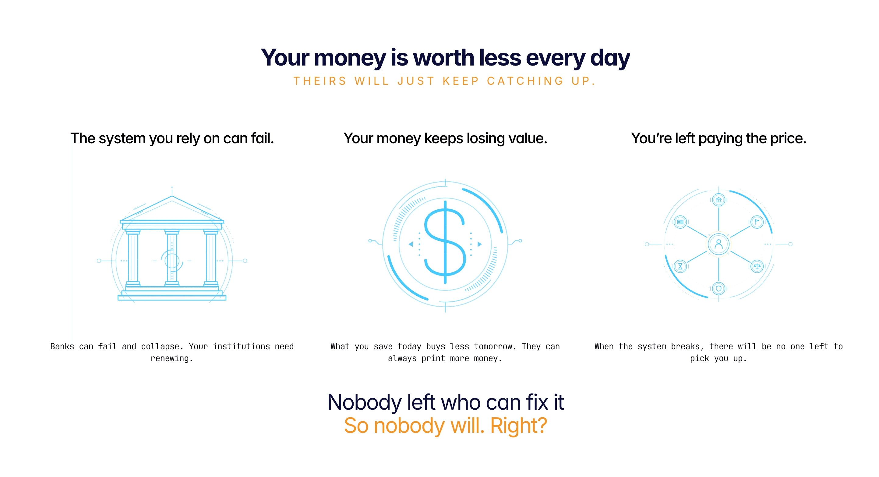
The second block explains why an alternative system is being proposed. By connecting Saaga to the limitations of the current financial model.

THE MODEL
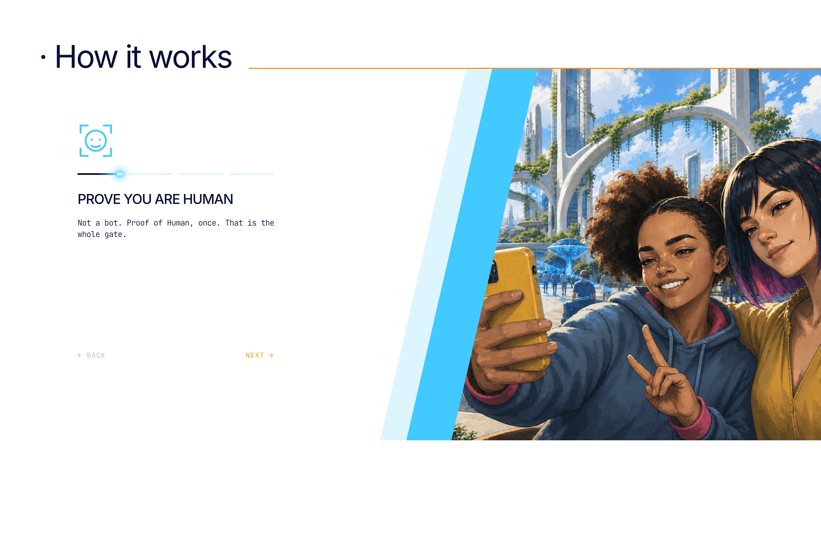
This block breaks the proposal down into its main principles. It explains how the system is organised and what it is designed to offer.


VALUE
This block focuses on what Saaga could offer in practice: a clear way for people to participate and a visible sense of how the system would operate over time.


TRUST
It focuses on participation, transparency and the network supporting it, making the concept more tangible.

INVITATION
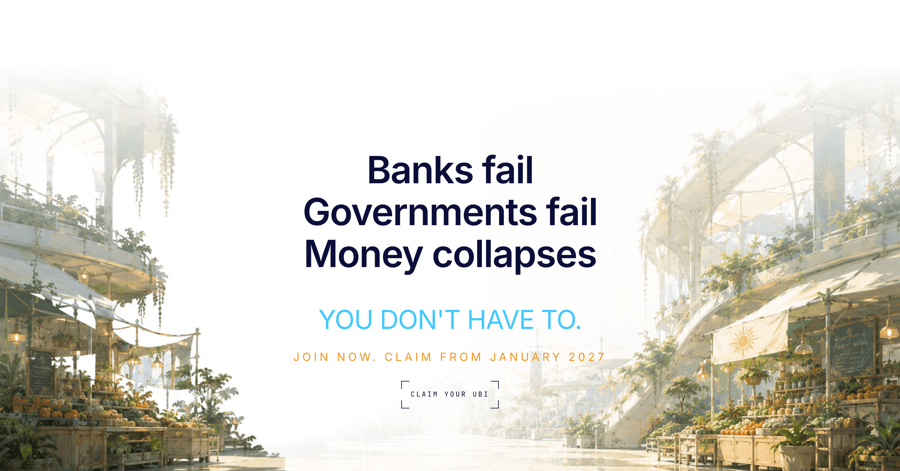
The final block brings the narrative back to the visitor. It addresses the questions that may still remain and gives the idea a clear next step.
Interaction & Motion
Hero pin
Keeping the main message in place while the visual scene develops behind it gives visitors time to understand the premise without losing the impact of the hero.
Entrance choreography
Content rises in sequence, not all at once. it avoids the page feeling static before the argument even starts.
“How it works” tabs
The process is divided into four steps, so the tab interaction follows the logic of the content. clicking through keeps the reader an active participant, not a spectator.
FAQ accordion
It lets visitors choose which questions they want to explore and keeps the rest out of view. This keeps the section clean and prevents too much information from competing for attention at the same time.
Feature radial diagram
The six features are arranged around a shared centre instead of being presented as a standard grid. This makes their relationship visible and presents Saaga's solar-punk visual.
Network animation
The animation makes the relationship between the Central Bank, the network and individual transactions easier to follow. It gives a visual form to the transparency principle at the centre of the project.
Live metrics ticker
The final numbers never change — Saaga is fictional — but watching them climb is what makes the claim feel real instead of just declared.
Responsive Design
No single layout stretched to fit, each breakpoint rebuilt to hold its own weight.

Creative Workflow
Five tools, one workflow.
Framer
Design & development of the entire project
Figma
Sketching & understanding the graphic elements
Claude
Code for custom, fluid components
" height="39.64300333084981px" id="JzpodKak9" transform="translate(0 0.167)" width="40px"/></svg>)
Codex & GPT
Code for custom components & image generation
Conclusion
An idea given shape, and the workflow that got it there.
Saaga was, first and foremost, the experience of watching an idea come alive: taking something abstract and giving it a visible, working structure on a real website. Seeing a concept move from a conversation to an interface people can actually navigate was genuinely exciting.
It was also a real pleasure to build alongside another professional. Learning how to shape a shared project, hand off work cleanly, and deliver something whole out of two people’s ideas taught me a lot, and it was rewarding to watch the concept grow richer every time someone else added their own touch to it.
Beyond the interface itself, Saaga was a lesson in how marketing and product pages are put together, structurally and narratively, to guide someone from curiosity to understanding and make a product’s purpose clear before they’ve had to think too hard about it.